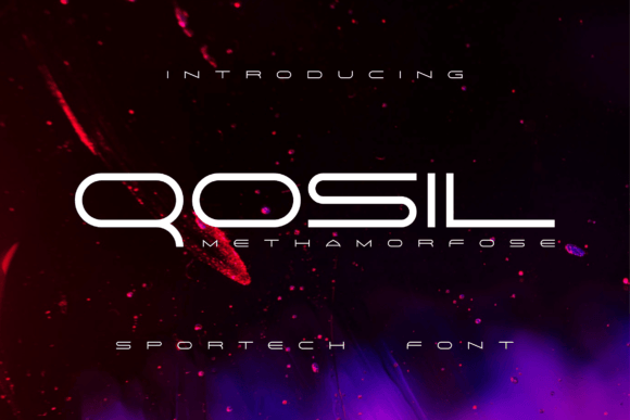
Qosil Methamorfose: A Futuristic Display Font for Digital Branding
Two weeks ago, I was finalizing the hero section of a new landing page for a creative coaching practice — clean layout, soft gradient background, intentional whitespace. But something felt off in the headline. The current sans serif felt safe, almost generic. So I pulled up Qosil Methamorfose, loaded it into my local dev environment, and dropped it into the H1 tag. Instantly, the tone shifted: sharper, more intentional, quietly confident.
Qosil Methamorfose is a display font built for digital presence — not just decoration. Its letterforms balance geometric precision with subtle organic flow: tight apertures, tapered terminals, and a slight optical lift in uppercase characters that catch light differently on screen. It doesn’t shout. It leans in. That makes it ideal for projects where modernity and clarity must coexist — think product landing pages, portfolio headers, course sales banners, or boutique online store announcements.
I tested it across real scenarios: over a muted video background (works beautifully at 48px+ with 80% opacity text shadow), as a sticky header on scroll (holds weight without visual fatigue), and inside a mobile-first CTA button (paired with a subtle hover scale animation). In every case, it reinforced brand voice without compromising usability. It’s not meant for body copy — and that’s by design. As a display font, its strength lies in impact, not endurance.
Here’s what stood out in practice:
- Visual hierarchy works intuitively. Even at smaller sizes (32–40px), Qosil Methamorfose creates clear distinction between headline and supporting text — no extra spacing or bold overrides needed.
- Mobile readability is surprisingly strong. On iOS Safari and Chrome Android, the open counters and consistent stroke contrast kept legibility high, especially against light or neutral backgrounds. Just avoid using it below 28px on small screens — it starts to lose its character.
- It pairs effortlessly with functional typefaces. I used Inter (variable) for all body text and captions — the neutrality of Inter lets Qosil Methamorfose shine without competing. For a more editorial feel, try pairing it with a warm, low-contrast serif like Literata or Cormorant Garamond — but only for short quotes or section dividers.
- Dark mode behaves well. With a slight increase in letter-spacing (0.5px) and a subtle text-shadow (0 1px 2px rgba(0,0,0,0.15)), it stays crisp and dimensional on dark backgrounds — no muddy edges or haloing.
Where does it work best? Not everywhere — and that’s part of its value. Use Qosil Methamorfose for:
- Hero headlines and subheadlines (especially with animated fade-in or staggered load)
- Section titles that introduce new content blocks (e.g., “How It Works”, “Your Journey Starts Here”)
- Short, high-intent CTAs (“Get Early Access”, “Join the Waitlist”, “Launch Your Project”)
- Digital brand kits — particularly for tech-adjacent services, design studios, or forward-thinking educators
- Social media cover graphics and campaign landing page banners (export as SVG or use as webfont with
@font-face)
Where to pause and reconsider? Avoid long paragraphs, navigation menus, form labels, or anything requiring rapid scanning. It’s also not ideal for logos that need extreme scalability down to favicon size — the fine details soften too much below 24px. And while it supports Latin-based languages well, check multilingual support if your audience includes extended diacritics or non-Latin scripts — the base package covers Western European languages thoroughly, but Cyrillic or Greek require verification.
On the technical side: Qosil Methamorfose ships as WOFF2 (optimized for web), includes OpenType features like stylistic alternates and ligatures, and offers one primary weight — which is actually a strength. It removes decision fatigue. No need to juggle Light, Medium, Bold — just deploy it confidently where emphasis matters most. Licensing is commercial-friendly, including SaaS dashboards and client websites, as long as you’ve purchased the correct tier. Always confirm usage rights before embedding in templates or white-labeled products.
I also noticed how it changed user perception during informal feedback sessions. When asked to describe the site’s tone, testers used words like “intentional”, “forward-looking”, and “polished” — not “futuristic” or “techy”, which tells me Qosil Methamorfose avoids cliché. It suggests innovation without leaning into sci-fi tropes. That nuance matters — especially for service-based brands that want to signal expertise, not novelty for novelty’s sake.
One unexpected win? Print collateral. I exported a few key headers as SVG for a digital brand kit PDF, and they scaled flawlessly — crisp at any size, minimal file bloat. That cross-medium flexibility makes it useful beyond the browser: email headers, pitch decks, even minimalist packaging mockups.
If you’re evaluating Qosil Methamorfose for your next project, ask yourself two things: Is this a moment where typography should carry meaning — not just information? And do you have a clean, supportive text companion for everything else? If yes, it’ll likely earn its place. It’s not a Swiss Army knife font. It’s a precision tool — for when you need your headline to land with quiet authority, your brand to feel both current and considered, and your digital presence to reflect intention, not inertia.
And honestly? After swapping it in, I didn’t go back.